Weather app Design
UI & Graphic design
Overview
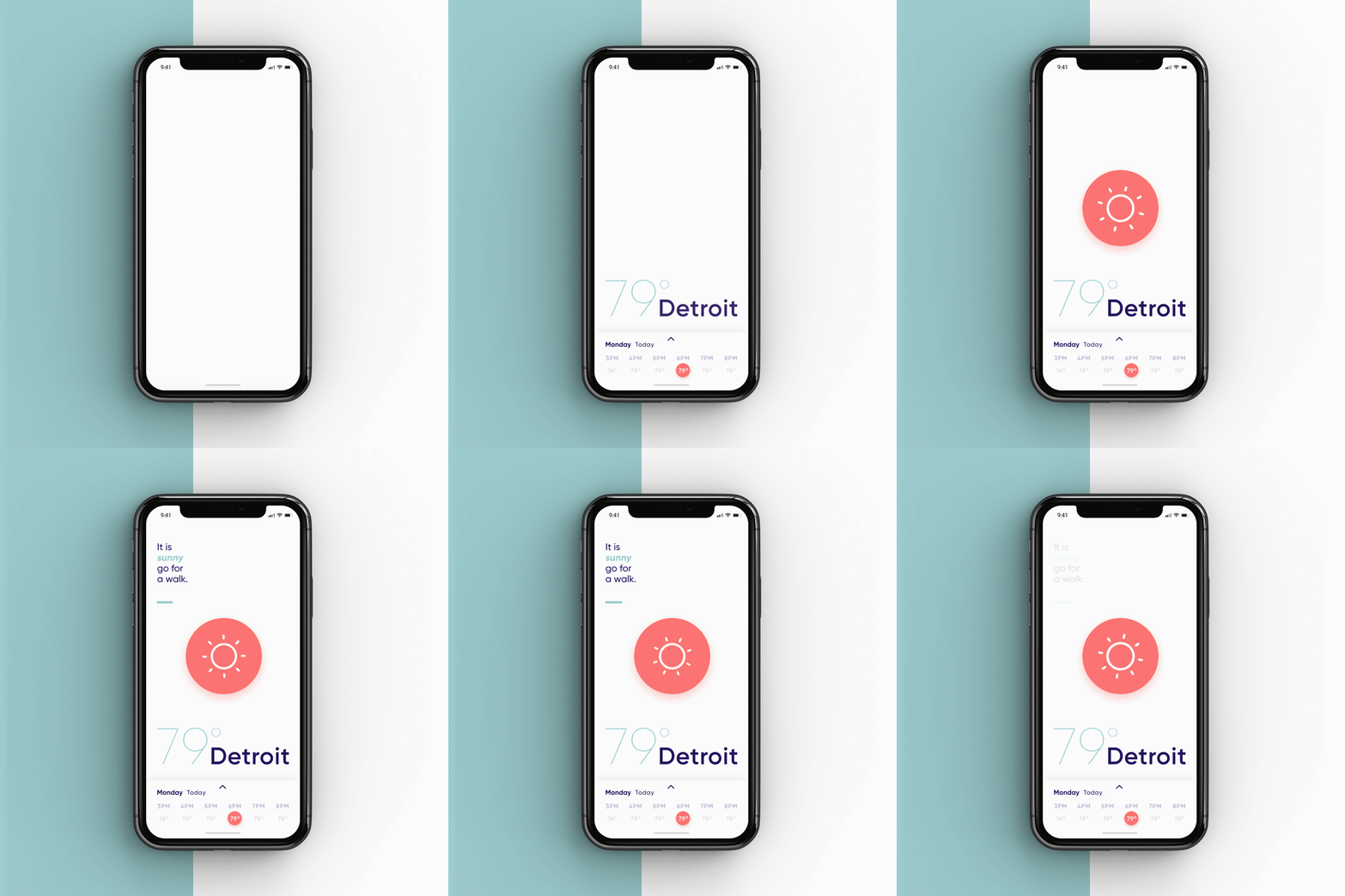
The standard weather app that comes with a phone gets the job done and works. But what if a weather app had something more to offer, Besides just getting the weather of the up and coming day or week? A weather app should get you prepared for that day! This is why I designed a weather app that had more personality, talked to you like a friend and made you feel something when you looked at the color palette or fun animations.
Colors
The approach to choosing the right color palette was to think of a color combination that had flexibility, easy on the eyes but gave a sense of energy to start your morning right. The solution was to find the harmony of pastels and some highlight colors that pack a punch with high contrast.
Typeface
Similar to the approach of finding the right color palette, flexibility and give the sense of calmness and warmth were the needs of the typeface. Gilroy was chosen not just for it’s flexibility and readability but for its modern moments of personality and energy the project needed.
Screens
Icon set
The icons were created to add to the personality and to be paired with the typeface. A rounded edge to the lines was used to mimic the geometric shapes found in the Gilroy typeface.


